

Golden Coast Refuge
A calming visual experience for victims of the LA fires
2 months
Shipped
March, 2024
Overview
Golden Coast Refuge is a mock non-profit supporting fire victims during the Palisades Fires in 2025. As a native Californian, my community has been changed in more ways than possibly imagined. Besides the physical aspects such as burnt neighborhoods and poor air quality, the spirit and morale of Los Angeles have been severely damaged. Golden Coast Refuge aims to comfort, uplift, and support victims of the California Fires through temporary housing, support groups, and resources.
Research
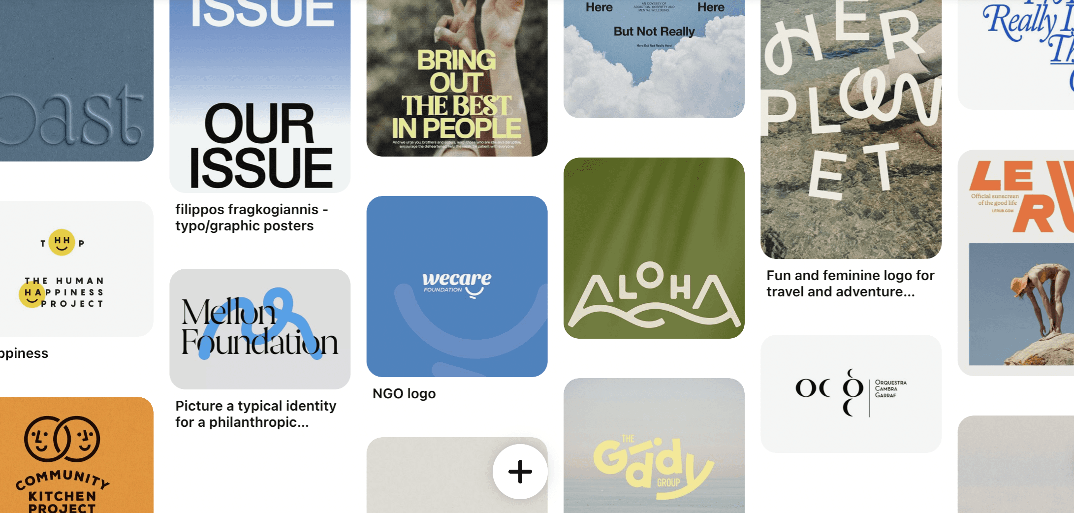
I particularly struggled during this project to find the right tone for my design. It was difficult to find the right balance between creating an engaging, entertaining, and aesthetic visual identity without romanticizing the tragic and devastating reality of the issue at hand. I had to hone in on my user research to make sure I was portraying what users wanted to see. After researching the visual identities of non-profits and organizations in similar areas, while surveying residents' needs, I found that what LA residents wanted the most was CALM, comfort, and clarity. I spent time on Pinterest finding logos, graphics, and color palettes that I felt suited this tone.
Iterate and Brainstorm
At the beginning of every design process, I give myself 60 seconds of undivided time to "questionstorm". I jot down as many questions as I possibly can without coming up with any answers.
"What some symbiotic elements that relate to fires that aren't just a literal flame?" "How can I relate my designs theme while also exuding calm and comforting?" "How can I keep the integrity and seriousness of my cause while still having fun with design?" "Where is that line?"
I then began to iterate, sketch, and play around with some ideas, starting with my logo. I played with the kerning of my letters, the fonts, the wave, and the colors, making sure to stick to my brand comms.
Define
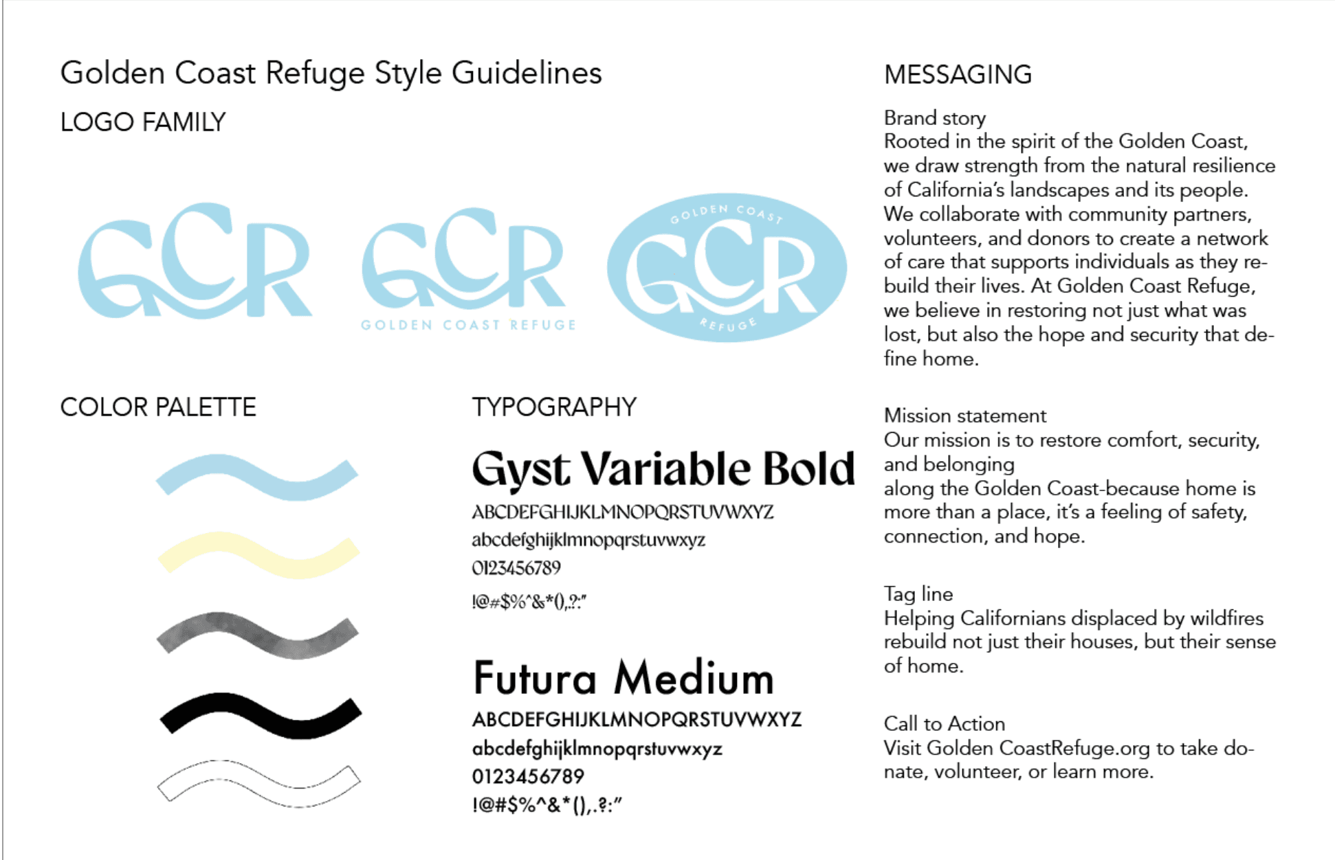
I ended up creating a set of logos and colors below, with the center wave derived from the couture line of the Pacific Coast Highway. I chose pale blue as my main color to keep my palette soft and clean, acting as a metaphor for the blue of the Pacific Ocean as well as the blue of a clear sky, representing new beginnings. I then chose a contrasting white and black for text to keep things simple and clear, as users had requested. This also prioritizes the delivery of information over the style of it, which is impactful as an informational non-profit. I chose smoke as my 2nd "color" to act as a sign of a fire being "put out" while offering textural interest and contrast. For my fonts, I chose Gyst as a playful, warm, and more fun font for the logo and Futura as a bold, simple font for the subtitles and text.
Execute
Once I had defined and tested my design, I perpetuated it through different example forms of media such as email marketing and social media graphics. These graphics demonstrate the success of the color palette, fonts, and smokey texture in relaying impactful information in a calm and comforting way.


Main Takeaway: When feeling lost and misguided in a project, always go back to the way you want your design to emotionally evoke or convey a message to its users
Read next
Question about my work?
Olivia Bruhmuller
Oliviabruhmuller@gmail.com

Golden Coast Refuge
A calming visual experience for victims of the LA fires
2 months
Shipped
March, 2024
Overview
Golden Coast Refuge is a mock non-profit supporting fire victims during the Palisades Fires in 2025. As a native Californian, my community has been changed in more ways than possibly imagined. Besides the physical aspects such as burnt neighborhoods and poor air quality, the spirit and morale of Los Angeles have been severely damaged. Golden Coast Refuge aims to comfort, uplift, and support victims of the California Fires through temporary housing, support groups, and resources.
Research
I particularly struggled during this project to find the right tone for my design. It was difficult to find the right balance between creating an engaging, entertaining, and aesthetic visual identity without romanticizing the tragic and devastating reality of the issue at hand. I had to hone in on my user research to make sure I was portraying what users wanted to see. After researching the visual identities of non-profits and organizations in similar areas, while surveying residents' needs, I found that what LA residents wanted the most was CALM, comfort, and clarity. I spent time on Pinterest finding logos, graphics, and color palettes that I felt suited this tone.
Iterate and Brainstorm
At the beginning of every design process, I give myself 60 seconds of undivided time to "questionstorm". I jot down as many questions as I possibly can without coming up with any answers.
"What some symbiotic elements that relate to fires that aren't just a literal flame?" "How can I relate my designs theme while also exuding calm and comforting?" "How can I keep the integrity and seriousness of my cause while still having fun with design?" "Where is that line?"
I then began to iterate, sketch, and play around with some ideas, starting with my logo. I played with the kerning of my letters, the fonts, the wave, and the colors, making sure to stick to my brand comms.
Define
I ended up creating a set of logos and colors below, with the center wave derived from the couture line of the Pacific Coast Highway. I chose pale blue as my main color to keep my palette soft and clean, acting as a metaphor for the blue of the Pacific Ocean as well as the blue of a clear sky, representing new beginnings. I then chose a contrasting white and black for text to keep things simple and clear, as users had requested. This also prioritizes the delivery of information over the style of it, which is impactful as an informational non-profit. I chose smoke as my 2nd "color" to act as a sign of a fire being "put out" while offering textural interest and contrast. For my fonts, I chose Gyst as a playful, warm, and more fun font for the logo and Futura as a bold, simple font for the subtitles and text.
Execute
Once I had defined and tested my design, I perpetuated it through different example forms of media such as email marketing and social media graphics. These graphics demonstrate the success of the color palette, fonts, and smokey texture in relaying impactful information in a calm and comforting way.
Main Takeaway: When feeling lost and misguided in a project, always go back to the way you want your design to emotionally evoke or convey a message to its users
Read next
Question about my work?
Olivia Bruhmuller
Oliviabruhmuller@gmail.com