
Airbnb Mock Case Study
Airbnb
3 months
Shipped
Project Under Construction

The global freshwater crisis is one of the most pressing environmental and humanitarian issues of our time. With only about 1% of the Earth's water available as fresh, usable water, millions of people face daily challenges in accessing clean, affordable, and safe drinking water, even in urban dense areas.
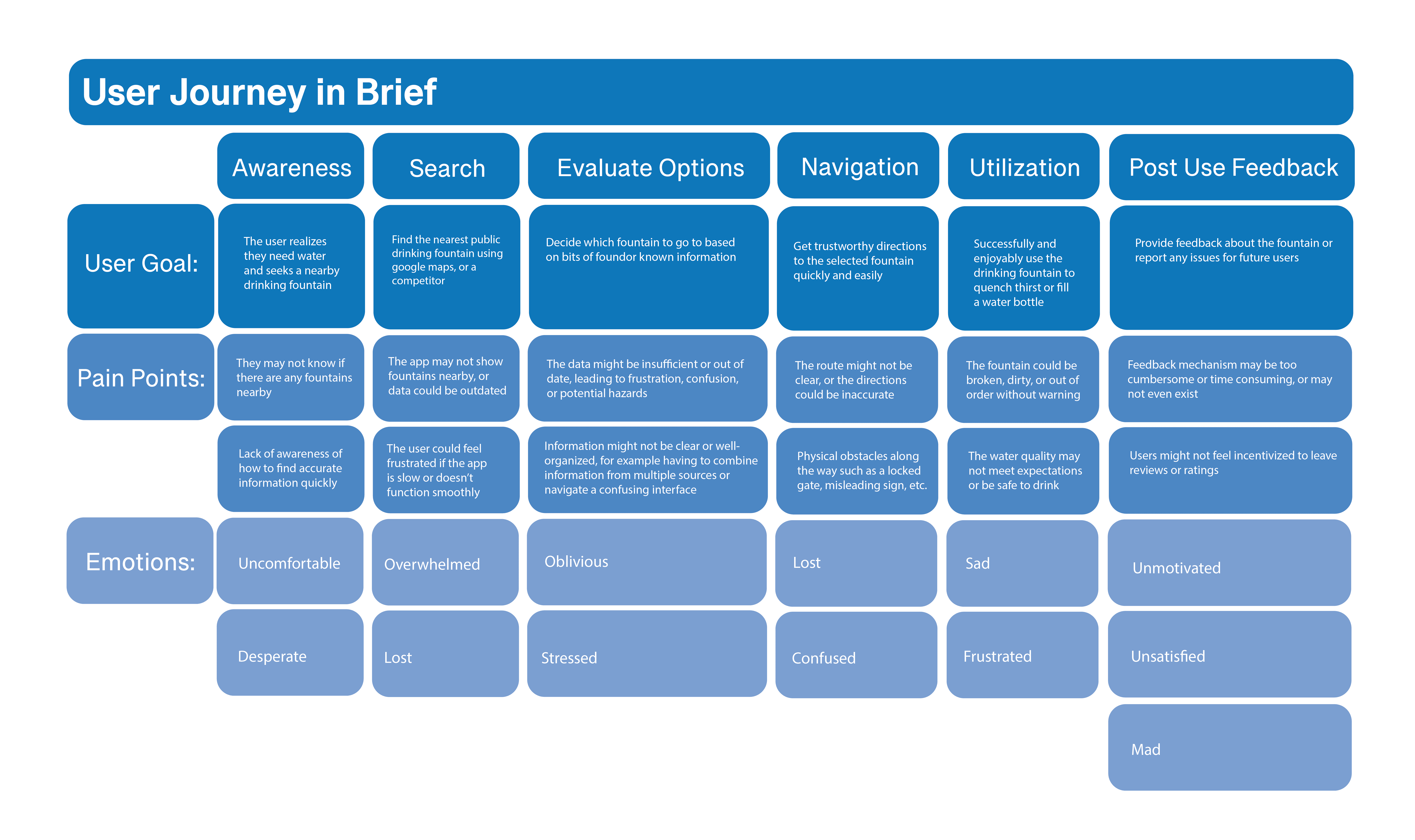
After educating myself on the subject at hand, I began to conduct extensive user research. I surveyed a sample of 35 frequent travelers, farm workers, small business owners, residents of urban cities, and residents of remote/rural areas. From this data, mapped a comprehensive user journey (shown below) and a competitive analysis. To conclude my research, I categorized the current user experience into three major points when it comes to accessing public drinking water.
1: Drinking fountains, public faucets, and other access points to water are rarely listed on GPS services.
2: If there is a drinking fountain in GPS, there is no way to tell if it’s still operational, functional, or nonexistent.
3: There is no way to tell if these water fountains are safe to drink from or contaminated without a physical test or lucky word of mouth.
After I felt satisfied with my existing research, I began to ideate. I asked myself the question: How do I make a user flow that is circular, intuitive, efficient, and effective in a public space? I created the user flow below to begin to visualize what Cleardrop would feel like to a user throughout every stage of the user journey map.

After understanding the feel of the app, I continued to ideate, beginning my UI guidelines and wireframes. I asked myself these two questions:
How do I create a design that captures the fluid, peaceful energy of water while incorporating the application’s purpose? I settled on a yin-yang logo juxtaposing a water drop and a map pin, with a calm blue color palette and simple legible fonts.
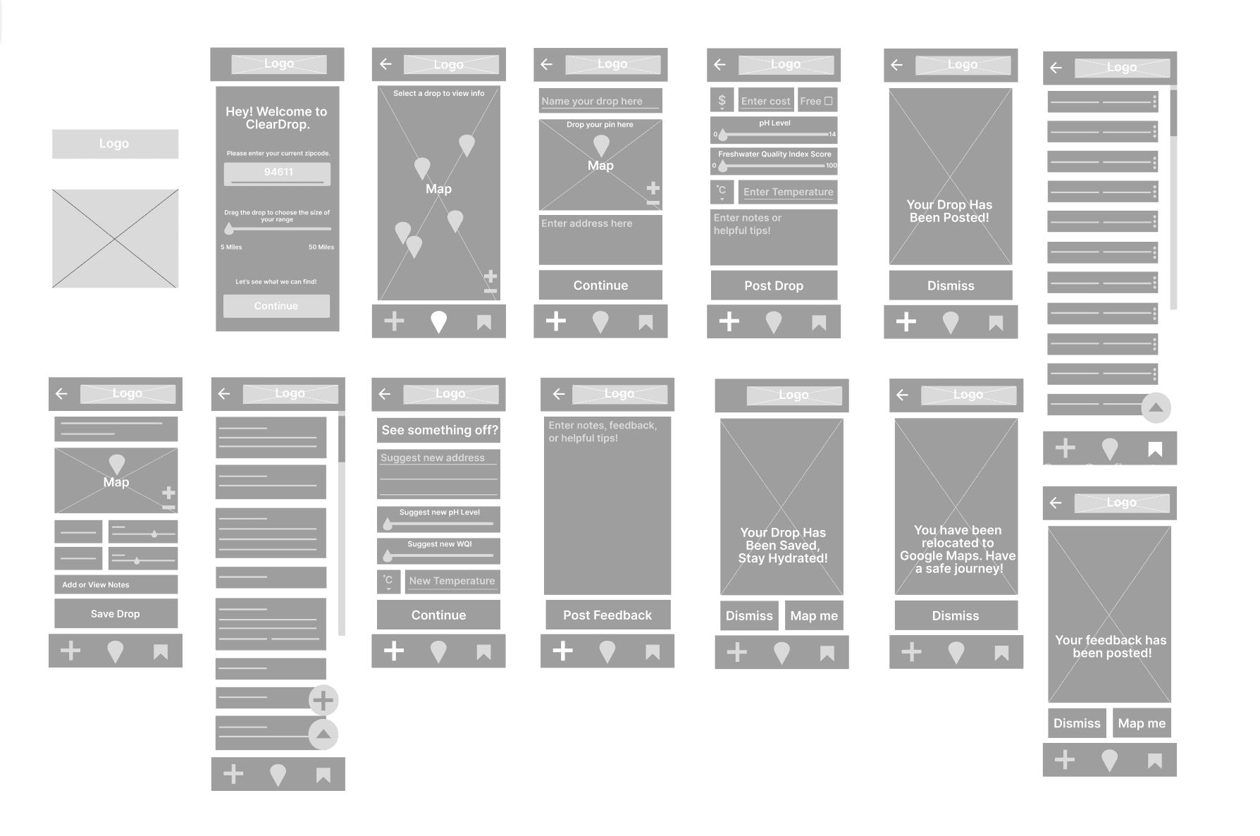
How do I create a layout that maximizes the space, and looks clean, simple, and intuitive? After many iterations, I crafted the wireframes below.
Cleardrop effectively demonstrates how user experience design and digital communication can play a great role in the well-being of society, human rights, and the greater good. Through this process, I have learned that one app cannot have everything, nor should it have everything. My products should focus on being clear, helpful, and efficient before adding extra features.
While Cleardrop is only a case study that will not be further developed into a function application, I look forward to revisiting Cleardrop when I have the proper resources for further steps.
Read next
Question about my work?
Olivia Bruhmuller
Oliviabruhmuller@gmail.com

Airbnb Mock Case Study
Airbnb
3 months
Shipped
Project Under Construction

The global freshwater crisis is one of the most pressing environmental and humanitarian issues of our time. With only about 1% of the Earth's water available as fresh, usable water, millions of people face daily challenges in accessing clean, affordable, and safe drinking water, even in urban dense areas.
After educating myself on the subject at hand, I began to conduct extensive user research. I surveyed a sample of 35 frequent travelers, farm workers, small business owners, residents of urban cities, and residents of remote/rural areas. From this data, mapped a comprehensive user journey (shown below) and a competitive analysis. To conclude my research, I categorized the current user experience into three major points when it comes to accessing public drinking water.
1: Drinking fountains, public faucets, and other access points to water are rarely listed on GPS services.
2: If there is a drinking fountain in GPS, there is no way to tell if it’s still operational, functional, or nonexistent.
3: There is no way to tell if these water fountains are safe to drink from or contaminated without a physical test or lucky word of mouth.

After I felt satisfied with my existing research, I began to ideate. I asked myself the question: How do I make a user flow that is circular, intuitive, efficient, and effective in a public space? I created the user flow below to begin to visualize what Cleardrop would feel like to a user throughout every stage of the user journey map.

After understanding the feel of the app, I continued to ideate, beginning my UI guidelines and wireframes. I asked myself these two questions:
How do I create a design that captures the fluid, peaceful energy of water while incorporating the application’s purpose? I settled on a yin-yang logo juxtaposing a water drop and a map pin, with a calm blue color palette and simple legible fonts.
How do I create a layout that maximizes the space, and looks clean, simple, and intuitive? After many iterations, I crafted the wireframes below.

Cleardrop effectively demonstrates how user experience design and digital communication can play a great role in the well-being of society, human rights, and the greater good. Through this process, I have learned that one app cannot have everything, nor should it have everything. My products should focus on being clear, helpful, and efficient before adding extra features.
While Cleardrop is only a case study that will not be further developed into a function application, I look forward to revisiting Cleardrop when I have the proper resources for further steps.
Read next
Question about my work?
Olivia Bruhmuller
Oliviabruhmuller@gmail.com

Airbnb Mock Case Study
Airbnb
3 months
Shipped
Project Under Construction

The global freshwater crisis is one of the most pressing environmental and humanitarian issues of our time. With only about 1% of the Earth's water available as fresh, usable water, millions of people face daily challenges in accessing clean, affordable, and safe drinking water, even in urban dense areas.
After educating myself on the subject at hand, I began to conduct extensive user research. I surveyed a sample of 35 frequent travelers, farm workers, small business owners, residents of urban cities, and residents of remote/rural areas. From this data, mapped a comprehensive user journey (shown below) and a competitive analysis. To conclude my research, I categorized the current user experience into three major points when it comes to accessing public drinking water.
1: Drinking fountains, public faucets, and other access points to water are rarely listed on GPS services.
2: If there is a drinking fountain in GPS, there is no way to tell if it’s still operational, functional, or nonexistent.
3: There is no way to tell if these water fountains are safe to drink from or contaminated without a physical test or lucky word of mouth.

After I felt satisfied with my existing research, I began to ideate. I asked myself the question: How do I make a user flow that is circular, intuitive, efficient, and effective in a public space? I created the user flow below to begin to visualize what Cleardrop would feel like to a user throughout every stage of the user journey map.

After understanding the feel of the app, I continued to ideate, beginning my UI guidelines and wireframes. I asked myself these two questions:
How do I create a design that captures the fluid, peaceful energy of water while incorporating the application’s purpose? I settled on a yin-yang logo juxtaposing a water drop and a map pin, with a calm blue color palette and simple legible fonts.
How do I create a layout that maximizes the space, and looks clean, simple, and intuitive? After many iterations, I crafted the wireframes below.

Cleardrop effectively demonstrates how user experience design and digital communication can play a great role in the well-being of society, human rights, and the greater good. Through this process, I have learned that one app cannot have everything, nor should it have everything. My products should focus on being clear, helpful, and efficient before adding extra features.
While Cleardrop is only a case study that will not be further developed into a function application, I look forward to revisiting Cleardrop when I have the proper resources for further steps.
Read next
Question about my work?
Olivia Bruhmuller
Oliviabruhmuller@gmail.com

