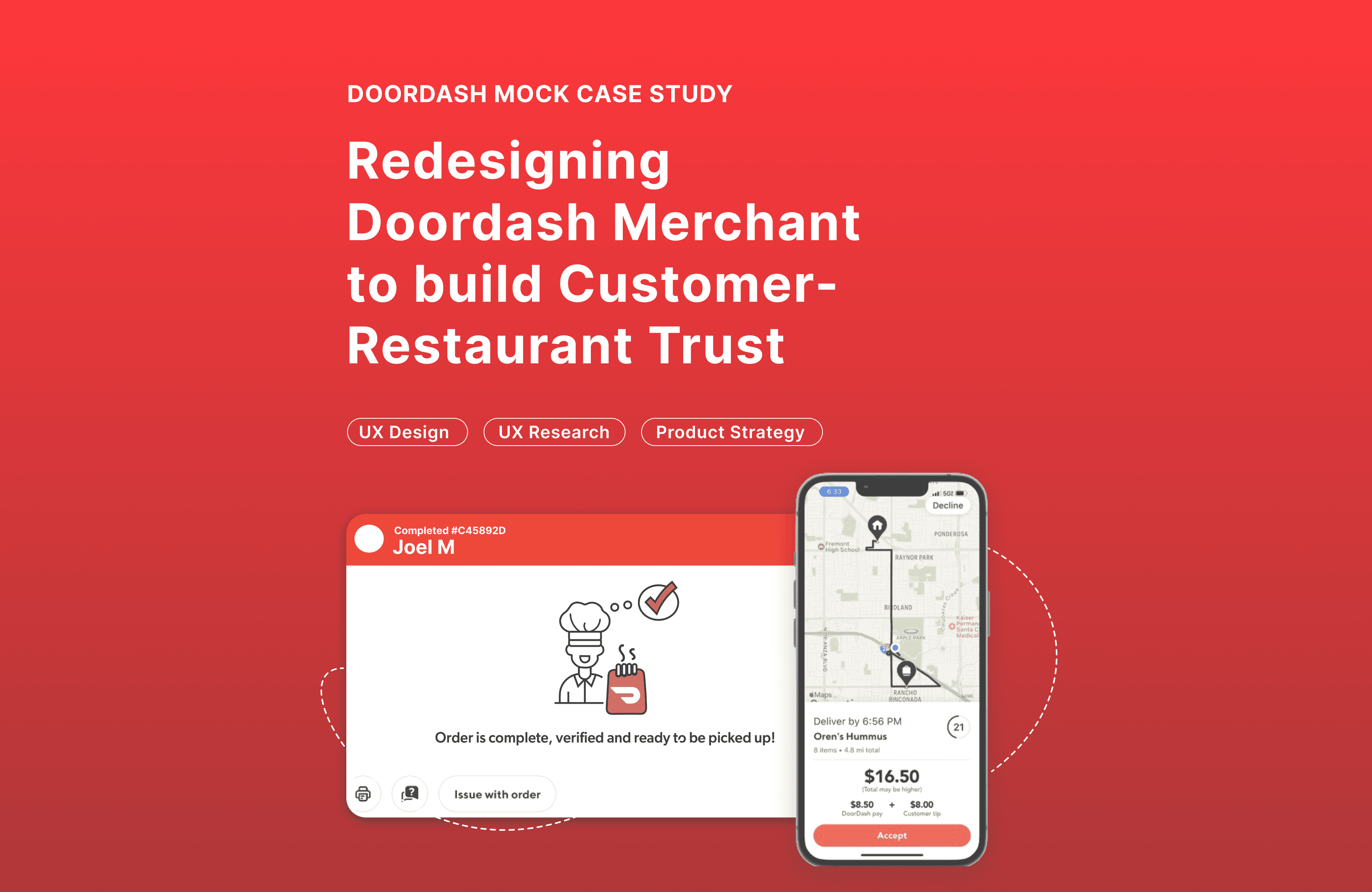
Doordash Mock Case Study
"How can I increase order consistency and merchant/customer trust through a simple additional feature?"
4 months
Shipped
UX Casestudy
*Mock study, not affiliated with Doordash
My curiosity began during the summer of 2024 when I worked weekends as a hostess at a local restaurant.
On busy Friday nights, I was in charge of the to-go orders. The Doordash tablet would buzz nonstop, and I would frantically shove tacos and burgers into a bag, skim the receipt, pass it to the Doordash driver, and then bag the next order. When I would finally get home that night and get ready for bed, a list would scroll in my head of every item I forgot. The side of dressing, the gluten-free bun, the plastic utensils, etc. I've also been on the flip side of the situation. I've been on the couch with my college roommates anxiously anticipating our Chipotle order, only to find out they forgot my bowl.
I've been the forgetter, and the forgotten.
While DoorDash's UX is highly regarded for its intuitive, user-centric design, with nearly seamless features like real-time order tracking, transparent pricing, and detailed delivery, there is inevitably still room for human error and mistakes.
The Item Verification feature acts as a "mandatory" checklist for the order managers, ensuring every item has been included. It offers an itemized checklist before the order is marked as “ready to pickup” intended to slow down the worker and act as a double check during a busy shift.

After my initial frustrating experience with Doordash, I could immediately envision a Doordash verification feature and wanted to see if it was a viable idea. I surveyed dozens of users from ages 18-50. The data demonstrated the following:
95% of surveyed food workers believe this feature would lower their stress levels in the workplace.
85% of surveyed food workers believe this feature would improve the accuracy of the orders they package.
82% of surveyed DoorDash users believe this feature would increase their trust in DoorDash to deliver accurate orders.
74% of participants would use DoorDash more often if orders were consistently more accurate.
70% of participants prefer other delivery apps over DoorDash due to order inaccuracies.
67% of surveyed food workers think this feature is worth an extra 15 seconds added to the user experience.
60% of surveyed DoorDash users believe this feature would increase their usage frequency of the DoorDash app/product.
I then got to work organizing the existing Doordash Merchant user journey.
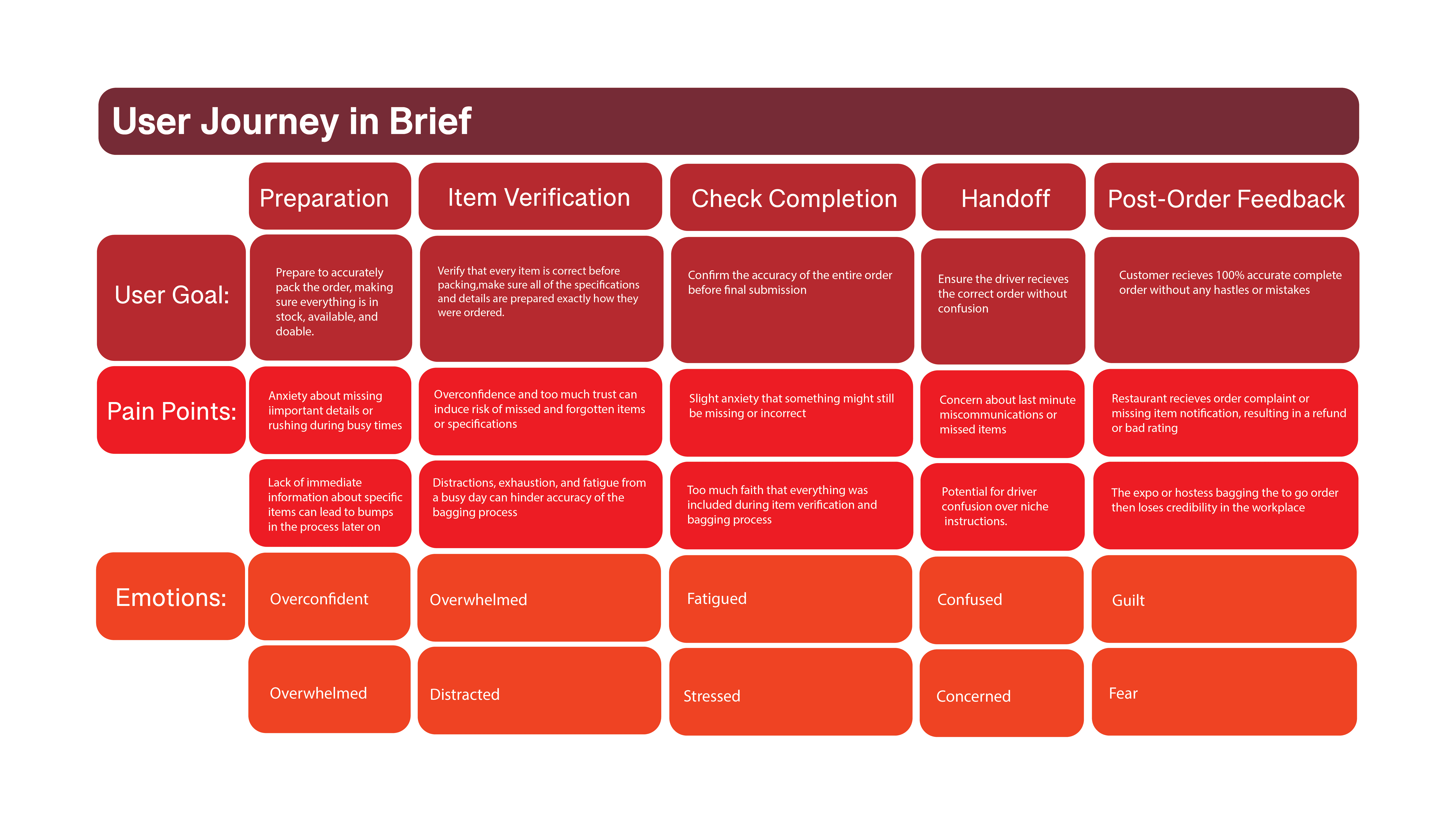
Based on the information from the user journey above, I consolidated the data into 3 major pain points:
1: On a busy night, there is no vetting process to make sure the restaurant has included all of the correct items until the order is already delivered
2: Food service workers can be easily overwhelmed by mass amounts of orders and ship out incorrect orders
3: The only current way to verify an order is to skim a receipt, leaving more room for error and human mistake
With these in mind, I began to ideate a user flow that offers an extra level of cognitive support to the food workers and an extra level of verification to Doordash users.

After I crafted the flow and feel of the digital feature, I began to wireframe, as shown below. I asked myself, "How do I create a layout that maximizes the space, and looks clean, simple, and intuitive?" The app needs to be quick and simple with minimal information and pages for a busy and bustling atmosphere.

This Doordash feature design taught me numerous lessons.
User design that raises worker morale ultimately creates a higher customer morale and therefore a better product.
It is crucial to design for not only the user but the environment. For example, a busy restaurant needs a quick, simple, and efficient design with bold large buttons and minimal clicks.
Redesigning previous products is a great way to save time and challenge yourself to work within existing constraints
Read next
Question about my work?
Olivia Bruhmuller
Oliviabruhmuller@gmail.com

Doordash Mock Case Study
"How can I increase order consistency and merchant/customer trust through a simple additional feature?"
4 months
Shipped
UX Casestudy
*Mock study, not affiliated with Doordash
My curiosity began during the summer of 2024 when I worked weekends as a hostess at a local restaurant.
On busy Friday nights, I was in charge of the to-go orders. The Doordash tablet would buzz nonstop, and I would frantically shove tacos and burgers into a bag, skim the receipt, pass it to the Doordash driver, and then bag the next order. When I would finally get home that night and get ready for bed, a list would scroll in my head of every item I forgot. The side of dressing, the gluten-free bun, the plastic utensils, etc. I've also been on the flip side of the situation. I've been on the couch with my college roommates anxiously anticipating our Chipotle order, only to find out they forgot my bowl.
I've been the forgetter, and the forgotten.
While DoorDash's UX is highly regarded for its intuitive, user-centric design, with nearly seamless features like real-time order tracking, transparent pricing, and detailed delivery, there is inevitably still room for human error and mistakes.
The Item Verification feature acts as a "mandatory" checklist for the order managers, ensuring every item has been included. It offers an itemized checklist before the order is marked as “ready to pickup” intended to slow down the worker and act as a double check during a busy shift.

After my initial frustrating experience with Doordash, I could immediately envision a Doordash verification feature and wanted to see if it was a viable idea. I surveyed dozens of users from ages 18-50. The data demonstrated the following:
95% of surveyed food workers believe this feature would lower their stress levels in the workplace.
85% of surveyed food workers believe this feature would improve the accuracy of the orders they package.
82% of surveyed DoorDash users believe this feature would increase their trust in DoorDash to deliver accurate orders.
74% of participants would use DoorDash more often if orders were consistently more accurate.
70% of participants prefer other delivery apps over DoorDash due to order inaccuracies.
67% of surveyed food workers think this feature is worth an extra 15 seconds added to the user experience.
60% of surveyed DoorDash users believe this feature would increase their usage frequency of the DoorDash app/product.
I then got to work organizing the existing Doordash Merchant user journey.

Based on the information from the user journey above, I consolidated the data into 3 major pain points:
1: On a busy night, there is no vetting process to make sure the restaurant has included all of the correct items until the order is already delivered
2: Food service workers can be easily overwhelmed by mass amounts of orders and ship out incorrect orders
3: The only current way to verify an order is to skim a receipt, leaving more room for error and human mistake
With these in mind, I began to ideate a user flow that offers an extra level of cognitive support to the food workers and an extra level of verification to Doordash users.

After I crafted the flow and feel of the digital feature, I began to wireframe, as shown below. I asked myself, "How do I create a layout that maximizes the space, and looks clean, simple, and intuitive?" The app needs to be quick and simple with minimal information and pages for a busy and bustling atmosphere.

This Doordash feature design taught me numerous lessons.
User design that raises worker morale ultimately creates a higher customer morale and therefore a better product.
It is crucial to design for not only the user but the environment. For example, a busy restaurant needs a quick, simple, and efficient design with bold large buttons and minimal clicks.
Redesigning previous products is a great way to save time and challenge yourself to work within existing constraints
Read next
Question about my work?
Olivia Bruhmuller
Oliviabruhmuller@gmail.com

Doordash Mock Case Study
"How can I increase order consistency and merchant/customer trust through a simple additional feature?"
4 months
Shipped
UX Casestudy
*Mock study, not affiliated with Doordash
My curiosity began during the summer of 2024 when I worked weekends as a hostess at a local restaurant.
On busy Friday nights, I was in charge of the to-go orders. The Doordash tablet would buzz nonstop, and I would frantically shove tacos and burgers into a bag, skim the receipt, pass it to the Doordash driver, and then bag the next order. When I would finally get home that night and get ready for bed, a list would scroll in my head of every item I forgot. The side of dressing, the gluten-free bun, the plastic utensils, etc. I've also been on the flip side of the situation. I've been on the couch with my college roommates anxiously anticipating our Chipotle order, only to find out they forgot my bowl.
I've been the forgetter, and the forgotten.
While DoorDash's UX is highly regarded for its intuitive, user-centric design, with nearly seamless features like real-time order tracking, transparent pricing, and detailed delivery, there is inevitably still room for human error and mistakes.
The Item Verification feature acts as a "mandatory" checklist for the order managers, ensuring every item has been included. It offers an itemized checklist before the order is marked as “ready to pickup” intended to slow down the worker and act as a double check during a busy shift.

After my initial frustrating experience with Doordash, I could immediately envision a Doordash verification feature and wanted to see if it was a viable idea. I surveyed dozens of users from ages 18-50. The data demonstrated the following:
95% of surveyed food workers believe this feature would lower their stress levels in the workplace.
85% of surveyed food workers believe this feature would improve the accuracy of the orders they package.
82% of surveyed DoorDash users believe this feature would increase their trust in DoorDash to deliver accurate orders.
74% of participants would use DoorDash more often if orders were consistently more accurate.
70% of participants prefer other delivery apps over DoorDash due to order inaccuracies.
67% of surveyed food workers think this feature is worth an extra 15 seconds added to the user experience.
60% of surveyed DoorDash users believe this feature would increase their usage frequency of the DoorDash app/product.
I then got to work organizing the existing Doordash Merchant user journey.

Based on the information from the user journey above, I consolidated the data into 3 major pain points:
1: On a busy night, there is no vetting process to make sure the restaurant has included all of the correct items until the order is already delivered
2: Food service workers can be easily overwhelmed by mass amounts of orders and ship out incorrect orders
3: The only current way to verify an order is to skim a receipt, leaving more room for error and human mistake
With these in mind, I began to ideate a user flow that offers an extra level of cognitive support to the food workers and an extra level of verification to Doordash users.

After I crafted the flow and feel of the digital feature, I began to wireframe, as shown below. I asked myself, "How do I create a layout that maximizes the space, and looks clean, simple, and intuitive?" The app needs to be quick and simple with minimal information and pages for a busy and bustling atmosphere.

This Doordash feature design taught me numerous lessons.
User design that raises worker morale ultimately creates a higher customer morale and therefore a better product.
It is crucial to design for not only the user but the environment. For example, a busy restaurant needs a quick, simple, and efficient design with bold large buttons and minimal clicks.
Redesigning previous products is a great way to save time and challenge yourself to work within existing constraints
Read next
Question about my work?
Olivia Bruhmuller
Oliviabruhmuller@gmail.com

